
Applied Portfolio Management
Applied Portfolio Management offered on both the undergraduate and graduate levels (BU 484 and BU 998, respectively) allows students to learn by managing an actual portfolio of stocks, thanks to funding provided by Washburn University Foundation.
The course operates like a business inside the School of Business – scheduled classes are run like meetings, and students are promoted through the series of job responsibilities including research associate, research analyst and portfolio manager. The lab-style setting and cutting edge research tools offered by the Technology Center also allows students to conduct a classic bottom-up fundamental analysis.
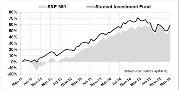
The Student Investment Fund (SIF) has slightly outpaced the S&P 500 over the past five years:
Student Investment Fund Results (2016)
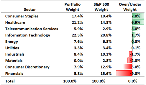
The Spring 2015 and 2016 classes correctly anticipated the economic slowdown (negative GDP growth in Q1 2015 and a paltry 0.5% GDP growth in Q1 2016) and repositioned the portfolio more defensively, with active sector overweights in Healthcare, Consumer Staples and Telecom. The market weight in Energy stocks is also defensive in this case, as the SIF Energy holdings are concentrated in low-beta, high dividend yield master limited partnership stocks such as Kinder Morgan and ONEOK. The underweights in Industrials, Materials, Consumer Discretionary and Financials further reflect the defensive posture of the portfolio.
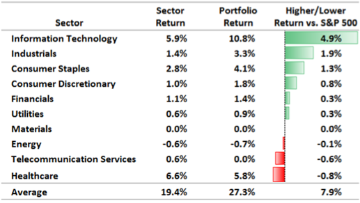
The following table shows the returns of the SIF by stock sector. The SIF active stock selections had higher returns in all sectors except for Telecom and Healthcare stocks. The SIF’s weighted return of 27.3% is 7.9% higher than it would have been if the portfolio was invested in all SPDR ETFs.
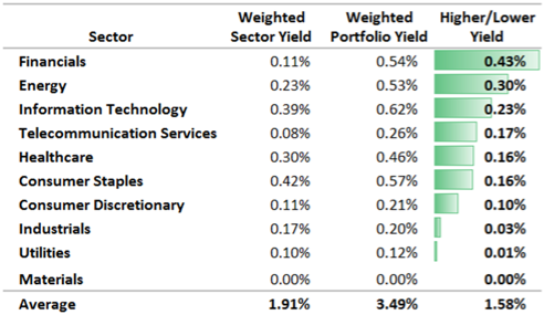
The following table shows the dividend yield of the SIF by stock sector. The SIF active stock selections had higher yields in all sectors except for materials stocks. The SIF’s weighted dividend yield of 3.49% is 1.58% higher than it would have been if the portfolio was invested in all SPDR ETFs.
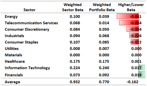
The following table shows the SIF beta by stock sector. The SIF active stock selections had lower betas than the corresponding ETFs in all sectors except Information Technology and Financials. Overall the SIF has a beta of 0.77. Had the portfolio instead held all ETFs with similar sector weightings, the SIF’s beta would have been 0.932.
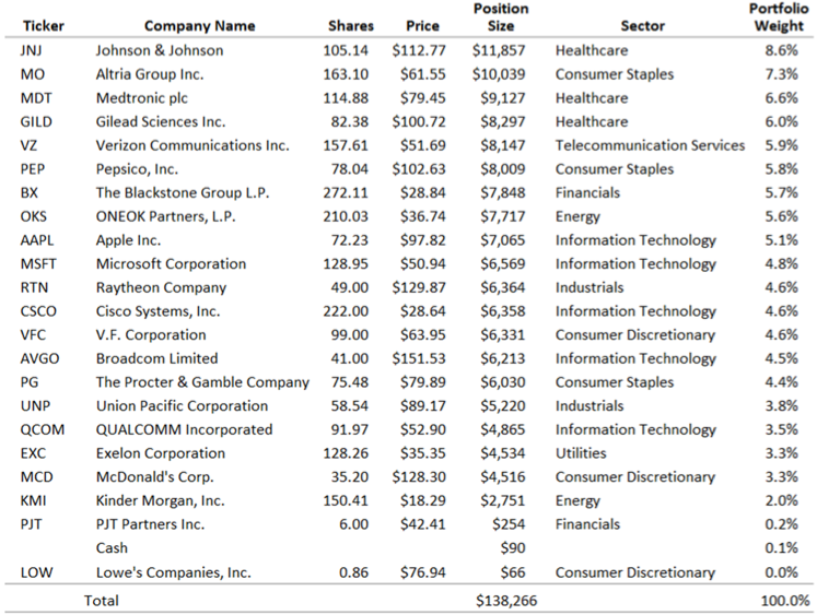
The table below shows the SIF’s current positions and the weight of each position in the SIF portfolio. The fund’s market value was $138,266 as of April 28, 2016.
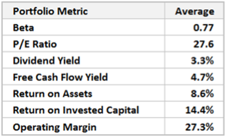
The table below shows the SIF’s weighted average P/E ratio, dividend yield, free cash flow yield, return on assets, return on invested capital and operating margin. Most fundamental portfolio characteristics are within acceptable limits. The average portfolio P/E ratio of 27.6 is high, and thus a concern, but indicative of a late-stage bull market where valuations are high across the board. The S&P 500 P/E based on twelve trailing months of GAAP earnings is 24.5 as of April, 2016.
Economic Outlook (2016)
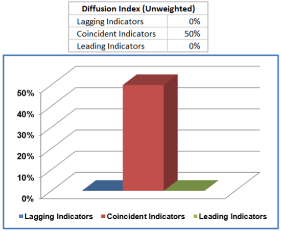
The following graphic summarizes the Spring 2016 classes’ analysis of the lagging, coincident and leading indicators. Business activity was neutral for most of 2015 (lagging), and after accelerating briefly late in the year (coincident), economic activity is predicted to slump back into a slow-growth phase for most of 2016, with GDP struggling to grow at a real rate of 2%. The detailed analysis of each indicator follows below.
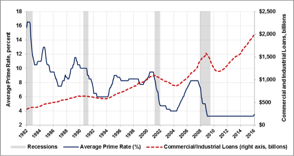
The average Prime Rate is a benchmark rate that is used by lenders for determining the interest rate to use on new loans. Typically, this metric is seen as a lagging indicator as banks will adjust their rates in response to economic conditions. If the economic growth is slow, banks will have low rates to attract new borrowers. In contrast, if economic growth is strong, and has been for a while, banks can raise the rates. As in the case for pre-2001 and pre-2008 recessions, the interest rate rises and plateaus just before the recession and declines sharply after the recession is realized. Currently we see very low (some would say artificially low) interest rates and high corresponding amounts of commercial and industrial loans. At the end of 2015, we did the first rise in interest which would signal economic strength. For that reason, we give it a score of +1.
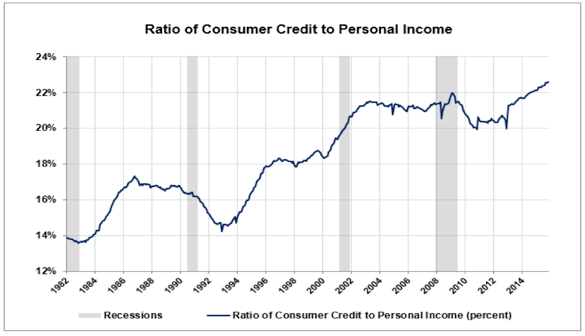
The ratio of consumer credit to personal income measures the balance between the income and debt levels of consumers. Because individuals tend to borrow when they expect favorable economic conditions, this metric serves as a way of measuring consumer confidence in the economy. Typically, consumer credit is used to purchase long-lived goods. Based on some of the coincident and leading indicators, it seems that credit is instead being used to purchase more short-lived goods such as retail. Under normal circumstances, consumer credit is seen as a sign of confidence in future economic conditions but because credit is being used to purchase short-live goods we will assign a score of 0.
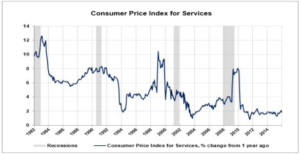
The Consumer Price Index (CPI) for services measures inflation that occurs in the service sector. The CPI in the past 5 years has maintained a low and stable rate of inflation as compared to the past 30 years. Looking at the years after each of the last three recessions, we see that that it takes several months and in some cases over a year for the inflation to drop significantly. After each recession we see a distinct trough followed by a gradual rise in inflation before the next recession takes place. Until the indicator hits its trough, there is little reason to expect unfavorable economic conditions. Also, while a low CPI is good for consumers, it is bad for businesses. In particular it hinders the ability of businesses to raises prices. Although the CPI has yet to hit its trough, its historically low rate signals that the expansion may not have much room to run. For these reasons, we assign a score of 0.
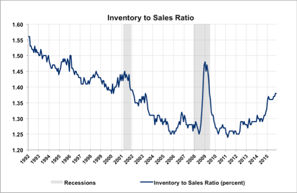
The Inventory to Sales Ratio measures the amount of inventory held as a percentage of sales. The long term downward trend of this indicator is reflective of increasing efficiency in inventory management. In the 2001 and 2008-2009 recessions, inventory to sales peaked in the midst of the recession due to reduced retail spending; the ratio began to fall after the economy started to recover. From 2010 to 2014, the inventory to sales ratio remained fairly steady between 1.27 and 1.33 percent. Over 2015, the ratio increased quite dramatically to 1.38. In order for inventory to sales to indicate strong economic conditions, we should expect to see this ratio return to its 2005-2014 range of 1.25-1.30. The increase in inventory to sales over the past year indicates slowed economic growth, warranting a score of -1.
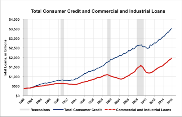
The Total Consumer Credit and Commercial and Industrial Loans indicator shows total outstanding credit to consumers and businesses. This measure is generally reflective of consumer and business confidence, and tends to increase during times of economic growth and decrease during recessions. During the 2008-2009 recession, it can be seen that the total amount of credit peaked and began to fall, for both consumers and businesses, during the middle of the recession. Credit has steadily grown since late 2010. This continued trend indicates that the economy has been steadily growing following the most recent recession. However, much of this credit growth can be attributed to the FED’s policy of zero interest rates, rendering this indicator unreliable as a measure of confidence. It receives a score of 0.
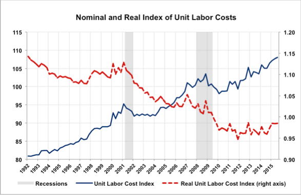
Unit Labor Costs measure both nominal and real levels of labor cost per worker in the economy. Unit labor costs tend to peak midway through a recession, followed by a decline or sideways trend which continues well into an expansion. Nominal labor costs peaked just before the 2001 recession, falling dramatically during the recession, and trending sideways until 2004. It again peaked toward the end of 2008, falling until it began to recover in 2011. In real terms, labor costs have fallen dramatically since 2001, suggesting that labor costs have not kept up with the inflation rate. The lack of positive direction in real unit labor costs is the reason that this indicator receives a score of 0.
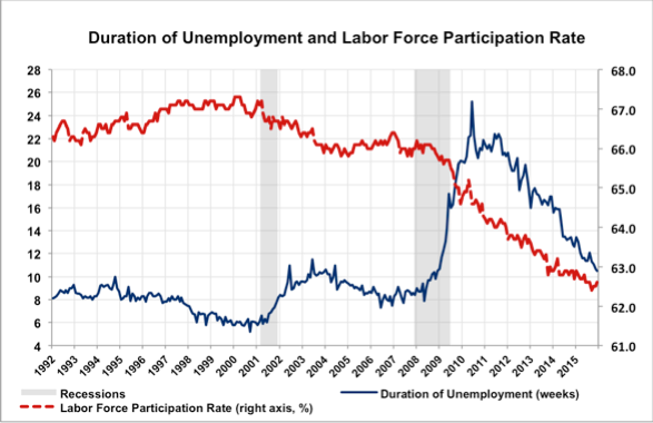
The average duration of unemployment measures the average length of time it takes a laid off worker to find work, when analyzed alongside the labor force participation rate, it provides insight in to the recent employment outlook in the economy. Average duration of unemployment tends to rise dramatically during a recession, peaking a few months after the recession has ended – as it did in both of the recent recessions. Average duration of unemployment has continued its steady decline since its peak in 2010 to 10.7 weeks, though it has not returned to its pre-recession level. The continued decline in the labor force participation rate casts further doubt on the level of economic expansion. In a period of economic growth, we should expect to see labor force participation to increase toward its pre-recession rate, while average duration of unemployment should continue to decrease. These indicators show little economic growth and receive a score of 0.
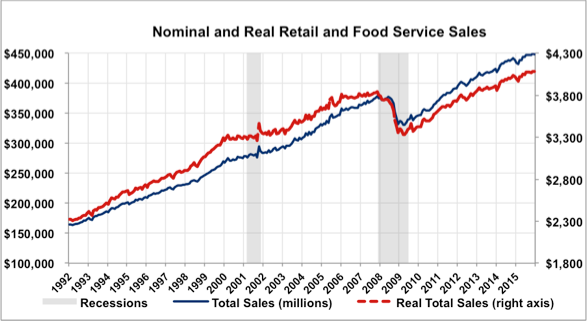
Total Sales
This indicator measures the total retail sales including the food industry. When total sales are rising consumers and businesses feel more confident about current economic activity. This indicator has only been tracked through the last two recessions. During the 2001 recession, the indicator did not coincide with the recession due to a large increase in the consumer credit ratio. In 2008 the indicator begins trending steeply downward following the recession. The indicator begins trending upward slightly before the economy recovers from the recession. As the indicator continues trending upward into 2016, a noticeable gap is being created between ‘Total Sales’ and ‘Real Total Sales’, indicating a rise in inflation. The strong upward trend of this coincident indicator is a bullish signal and thus deserves a score of +1 on the diffusion index.
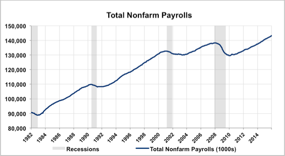
Total Nonfarm Payrolls
This indicator measures the total number of people with jobs in the U.S, whether full-time, part-time, or temporary. Historically this has been a reliable coincident indicator, as it rises with economic expansions and falls during economic contractions. When this indicator is rising it is associated as a bullish indicator to investors. Since the recovery of the recession in 2010, the indicator has been aggressively trending upward and has reached an all-time high. The steep incline in nonfarm payrolls indicates a strong economy and a bullish market, thus this coincident indicator deserves a +1 on the diffusion index.
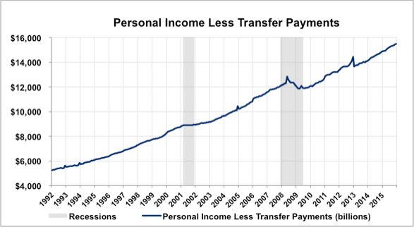
Income Less Transfers
Personal income is the main source of consumer spending an is thus an effective measurement of growth. This indicator is based on personal income from individuals and excludes any form of transfer payments. Historically the indicator has leveled off during recessions, except during the 2008 recession where it began to trend downward months after the recession began. After the drop during the 2008 recession the indicator began to slowly trend back upward, turning into a sharp incline after 2010. A sharp spike can observed at the end of 2012, but then quickly fades into the beginning of 2013. The indicator is currently trending upward and achieving all-time highs, which makes it appropriate to issue a score of +1 for the diffusion index.
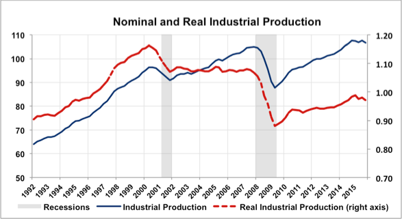
Industrial Production
This indicator measures physical output at all stages of production in the manufacturing, mining, and gas and electric utility industries. This index has been observed to have a strong correlation with changes in total output. The index appears to be more of a leading indicator as it trends steeply downward months before the 2001 crash. However in the recession of 2008 the indicator coincides with the recession. A large gap begins to form between ‘Industrial Production’ and ‘Real Industrial Production’ from 2009 to 2016. It can be assumed from this that inflation has been sharply increasing since 2009. Although production is trending upward, it fails to grow as quickly as it has in the past and begins to trend downward in the middle of 2015. Taking into factor the slow growth of output and the recent, small trend downward this indicator is given a score of 0 on the diffusion index.
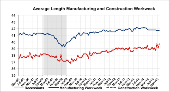
Average Length Manufacturing and Construction Workweek
This leading indicator represents if manufactures in the U.S. need employees to work longer hours, if manufactures have new orders, and if the economy is increasing. Since after recovering from the ’08-’09 recession, manufacturing workweek has been trending relatively sideways, increasing only an hour, which indicates stability in the sector and overall economy. Manufacturing has experienced a slight contraction since November of 2014, if this continues, there is potential for the overall economic activity to decelerate, which may follow with higher unemployment rates. Construction workweek appears to be bouncing around in a state of consolidation since November of 2012. The indicator was given a rating of +1.
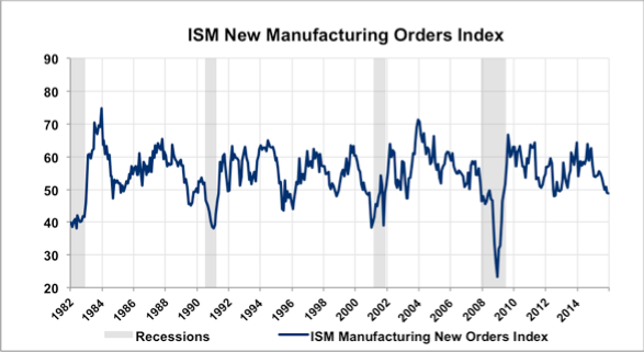
ISM New Manufacturing Orders Index
The ISM New Orders Index indicates if manufacturing orders are increasing or decreasing. 50 is considered the median for this index, any value greater represents new orders are increasing, thus any value under 50 represents that the number of new orders are decreasing. Thus index has proved to be a good leading indicator since 1982, decreasing leading up to the beginning of recessions, and increasing as the recessions come to an end. Since the ’08-’09 recession, ISM New Manufacturing Orders has been declining, and most recently slipped below 50, thus receiving a score of -1.
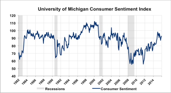
University of Michigan Consumer Sentiment Index
This Indicator shows when consumer are willing to spend more, or in the case of during the recessions, when consumers are willing to spend much less. Consumer spending makes up for nearly 70 percent of U.S. GDP; therefore this indicator is a good representation of the likelihood of consumer future spending. Consumer sentiment has recovered from the ’08-’09 recession to nearly the heights seen in the peak of 2004. This indicates that consumers are optimistic about the future, and are willing to spend more. We assigned this indicator a score of +1.
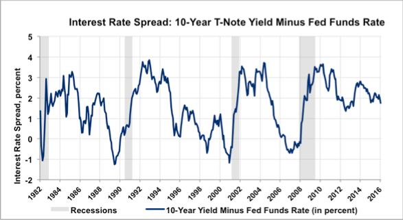
Interest Rate Spread: 10-Year T-Note Yield Minus Fed Funds Rate
The Interest Rate Spread represents the difference between the yield on a 10-year Treasury note and the shorter-term Federal Funds rate. This is a popular business cycle indicator since it shows the slope of the Treasury yield curve. Historically this index has been a good predictor of recessionary periods. Prior to the last three recessions the interest rate spread has contracted significantly. Since recovering from the most recent recession, interest rate spread has been trending downward. Since 2015 the rate spread has been consolidating around 2 percent, if it remains in consolidation this could represent an economic slowdown. However, if it slips out of consolidation and continues trending downward, this indicator could be warning of a possible economic recession. We gave this indicator a score of 0.
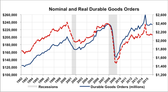
Nominal and Real Durable Goods Orders
Nominal and Real Durable Goods Orders represents consumers willingness to purchase big-ticket items, the more willing consumers are to buy these long-term goods, then they are likely feeling optimistic about future economic activity. Nominal and Real Durable Goods Orders dropped nearly 60 percent during the ’08-’09 recession. Since then durable goods orders has been trending upward with a brief spike during 2014. Since spiking in 2014 durable goods orders appear to be in a state of consolidation, which could mean that consumers have become less optimistic about future economic activity, leading us to a score of -1.
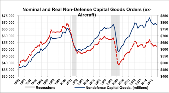
Nondefense Capital Goods (excluding aircraft)
This index shows how companies are spending in the economy and serves as a measure for future economic activity due to companies’ confidence. Aircraft is excluded since it is considered an outlier. These companies are they are making purchases then they are confident that they will make the sales to justify these purchases in the coming quarters. It is clear that this is a leading indicator because of its behavior leading up to the 2001 recession. This index began to take a fairly steep fall just prior to the 2001 recession. However, in the next recession it doesn’t peak until this point due it was lagging. While it is upward trending for a short time in recent years it has begun to trend sideways making a future forecast for this indicator challenging. We gave this indicator a score of 0.
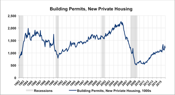
Building Permits
This indicator, building permits, new private housing, is an indicator of optimism in the market as it trends upward. This is due to the fact that homeowners and contractors are confident in the market and are willing to take the time and money to create new structures. Notice how in many of the recessions the number of permits began to fall sometime before the recession. Note the growth in permits after the 2008 recession; this steady upward trend indicates consumer optimism. How we may want the recent spike in permits could be significant and this indicator may be finding a peak and begin to trend downward signally a recession. This indicator received a score of 0.
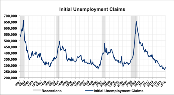
Unemployment Claims
Unemployment Claims can offer great insight into the general direction of the economy. Initial Unemployment claims in a weakening economy will trend upward. Since the current trend of this indicator is downward, this means we are looking at economic expansion. This indicator seems to be finding a new low over the past couple years indicating a rise could be coming similar to many instances prior to recessions. The conclusion to draw is there is a strong signal that unemployment claims have hit a new low since the last recessions and we could expect the number of claims to rise in the near future, leading us to a score of -1.
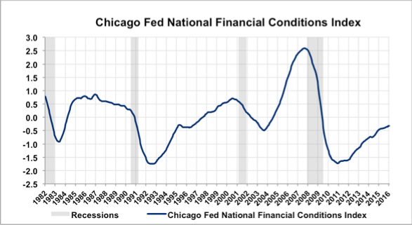
Chicago Fed National Finance Conditions Index
The Chicago Fed National Finance Conditions Index is a good measure of future economic activity since it measures the accessibility of credit within the economy. As the index values increase, credit becomes more difficult to attain, and economic activity slows (as is shown by peaks prior to the 2001 and 2008 recessions). The current index value of -0.4 represents relatively loose credit throughout the economy, and provides for an increase in economic activity as the economy continues to expand following the recession. In conclusion, the level of credit accessibility within an economy is important for sustaining economic growth, and this indicator seems to be trending upward towards more strict credit in the future. This indicator was given a score of +1.
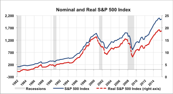
Nominal and Real S&P 500 Index
This indicator measures stock prices with and without adjusting for inflation. The indicator correctly predicted the 2001 recession with a steep decline prior to the economic slowdown, but then continued to fall after the recovery began. Conversely, the indicator missed the beginning of the 2008 recession but correctly predicted the economic rebound. Since 2010, prices have been on a strong upward trend as investors continue to buy, and, when adjusting for inflation, are reaching levels not seen since 2000. In conclusion, upward trending stock prices indicate an expanding economy. We gave this indicator a score of 0.
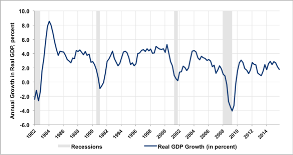
Real GDP growth measures the change in the market value of all final goods and services produced within the United States, adjusted for inflation. The indicator is considered a leading indicator as it falls prior to recessions and rises as the business cycle turns upwards. Real GDP growth in the past 15 years trends around 2.0%, with a drop to -4.6% at the bottom of the 2008 recession. Recent growth has been in consolidation, trending sideways and currently in the a 1% downtrend since mid 2015. Score: 0
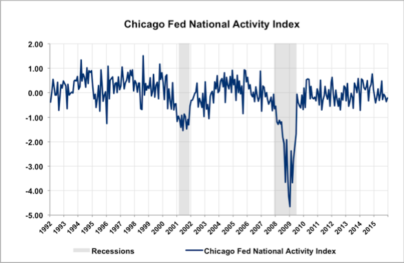
The Chicago Fed National Activity Index is designed to gauge overall economic activity along with related inflationary pressure. The monthly indicator trends downwards leading into recessions and recovers months before the recession ends. The index has been trending sideways since the 2008 recession; with a slight downwards trend between 0 and -1 since 2012. The index's slight downward trend notes the beginning of economic downturn. Score: -1
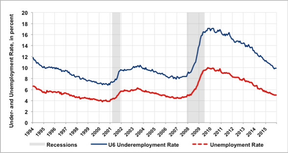
The under and unemployment rates measure the percent of the labor force that is out of work. Under and unemployment is considered a leading indicator because it acts ahead of the business cycle. Under and unemployment has been dropping steadily since the 2008 recession, with no upwards trend yet. Decline in under and unemployment has been sharper than the previous declines post-recession, declining from a high of 17% post-2008 recession to a still-falling 10% eight years later. Underemployment has dropped to a pre-2008 level in 2016, for the first time since the 2008 recession, sending a positive signal as under and unemployment is in a consistent downtrend. Score: +1
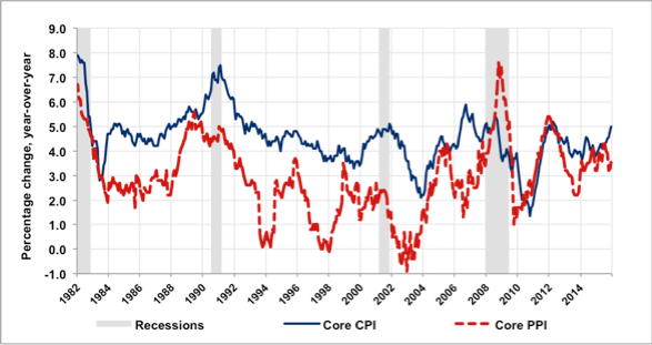
The Core CPI represents the aggregate of prices paid by urban consumers for a typical basket of goods, less highly the highly volatile food and energy, while the Producer Price Index is measures the aggregate prices of a basket of goods from a seller. The CPI percentage change has risen leading into the recession of the early 1990s and 2000s, but fell 1.5% prior to a .5% jump into the 2008 recession. Over the graph's 30 years, the CPI growth produced a downward-drifting trend, remaining above the PPI until mid 2008. The PPI fell below the CPI late 2009, then rose above the CPI 2010 through 2012. CPI has risen and remained above since 2013, and both indicators have been in consolidation since 2014. Score: 0
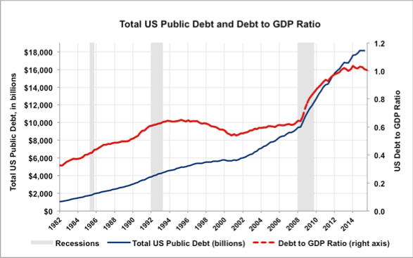
Total Public Debt measures the total federal debt, while debt to GDP is a ratio of debt over GDP to determine ability to cover federal debt. Total federal debt grew at a rate of $250B per year until doubling in 2001, until rising at just over $1.2TR from 2008 through today. Debt to GDP rose 40% from 2008 to 2013, and continues to hover around 1.0, or total federal debt equaling total GDP. Debt to GDP has fluctuated minimally around the 1.0 mark since 2013, indicating a maintenance of debt by GDP but no significant decrease. GDP growth is supporting the ratio as total debt has grown but debt to GDP remains constant around 1.0. Score: -1
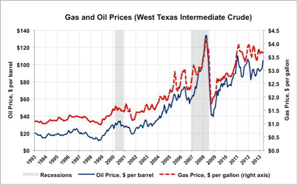
Gas price per gallon is a measure of the average price of gas from 900 retail outlets, while oil price is measured by West Texas Intermediate. Both gas and oil prices move together, though gas prices only fell below oil prices briefly at the end of the 2008 recession. Prices rose prior to the 2000 and 2008 recessions, with increased volatility marking the three years prior to the Great Recession. Oil prices have remained around $20 less than the high of $130 in 2008, though gas prices in the past five years have peaked dangerously close to the high of $4.00/gallon recorded in 2008. Oil and gas prices have risen over 100% since 2008 and have recently seen increased volatility, both trends leading to economic downturn and recession. Score: 0
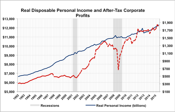
Real disposable personal income measures gross income less taxes, adjusted for inflation, while after-tax corporate profits measure profits of businesses, less taxes. Corporate profits are considered a leading indicator as it falls prior to recessions and rises prior to expansions. Real personal income has maintained consistent growth since 2013, rising $500B per year. Corporate profits have realized a $1.1TR growth since 2009, and the recent upwards trend since 2013 indicates an expansion. Score: +1
GET IN TOUCH WITH School of Business
School of Business
Henderson Room 114
1700 SW College Ave.
Topeka, KS 66621
Phone & Email
Ph: 785.670.1308
Fax: 785-670-1063
business@washburn.edu
